A to Z Steps
A Process. Not an Event
Strategic Steps
1. Proper Evaluation.
What is more important, the book or its cover ?
How many web sites are designed to look and feel great, but are inferior (in many respects)? Nice menus, well structured, superb effects, but fail on delivering the best results, through lack of strategic knowledge or experience.
Proper planning means getting the most important things right to begin with. Then moving onto the less important things. And maximizing each step’s results as you progress. Very few websites do that.
Proper web design is about web site management.
Structure, Layout, Copywriting and Graphics are determined by this.
NOT by what looks good.
Ask a designer : “What criteria were used to evaluate the site you propose ?”
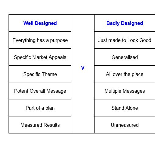
2. Good & Bad Design
To get things right is not necessarily more expensive than to get things wrong.
The time spent can be the same or less.
3. What is the purpose of the Website ?
Before you can design a website you need to know what you want it to do.
Specifically. Eg: Is it to just be informative, encourage trial, generate more enquiries or be part of a larger plan such as develop a brand (even in service industries) ?
4.Who is it for ?
You also need to know who the web site is aimed at, because different types of people are looking for different things priority wise and need to be appealed to and spoken to in different ways so they resonate correctly with you and believe that you are the best match for their needs.
The answer to this to is specialised grouping. Most markets can be grouped in one way or another, even if it is just locally, as in retail.
Grouping (or Segmentation) can be Demographic, Behavioural, Psychographic or Geographic.
There are other ways to group such as Professionally or by Trade and these are dealt with in other sections. Sometimes grouping does not apply such as in mass markets.
This is not just academia. It is the methodology used in world leading websites which can be applied to your web site without any extra cost.
Reputation is often key and correct segmentation allows blended targeting to enable this to be done with maximum effectiveness. This produces a much more potent effect such as developing an image which can overide a lot of competitive comparisons, and result in knee jerk reactions in your favour.
Even a sole trader can benefit from a web site properly done.
Tactical Steps
Most websites start here, but properly designed ones go through the above strategic sections first, to give direction to the rest of what needs to be done.
1. How should Content be Presented ?
In a manner which makes visitors deal with you.
Content is 80% of a website’s importance so this step is the most important tactical step.
Professional Text (Copywriting) can work 3 times better than a DIY job because it focuses on the RIGHT buying pressure points. Both factually AND psychologically.
DIY copywriting makes multiple mistakes. Eg: It often goes on about too many different things and doesn’t hit the nail on the head. Or it isn’t memorable. Or comes over as nothing special with no one particular message.
Do you know when to use long copy over short ?
Or how to deliver the right theme ?
2. What Graphics are Required ?
Photos or illustrations that are just there to show who you are or what a product is, does not optimise the opportunity of delivering a memorable web experience. Nor does it set you apart from competitors.
Graphics which blend with copywriting to deliver the effect of memorability and buying emotions in the minds of visitors to meet the website objectives is correct. To do that, the right use of certain colour schemes can create different emotions in visitors. The ones that encourage them to buy from you even in price sensitive markets.
3. How should the website be structured ?
Before anyone designs or improves a website for you, ask them to deliver an outline or plan showing what they intend to do and why. If they just talk about menus, layouts, designs, effects, experience in doing this etc, they will design something like looks nice but will be strategically weak.
Eg: In the highly competitive 3 star hotel market where the focus is value for money, facilities and location, the structure is mostly centred around photographs of the rooms and the rest of the hotel, so navigation menus need to be short but deep and copywriting theme emphasising value for money.
In the professionals market, focus is on how to spin biographical and other information in such a way to elicit more positive emotional responses, over and above other individuals or firms. Trust in delivery is key, so keeping things engaging with relevant positive reviews is fundemental.
4. How will users navigate around the website ?
The simpler the navigation the better.
Complex or flash navigation does not make visitors think how clever you are.
And sliding pictures with text, you’re in the middles of reading when it slides away, speaks for itself.
People are on your website to consider taking things further with you (or not) and are less likely to do so if you make it hard for them by diversions and irrelevancies regardless of how flashy it all looks.
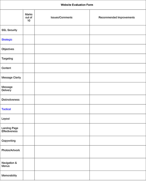
Evaluation Step
How should the finished result be evaluated ?
Does it meet the criteria that you set out for it ?
Do you know how to test this ?