Examples
These are some well categorized web site examples.
The categories a website falls into is determined by the complexity in making the site achieve its objectives at the level it is designed at. Not the extensivity of it or detail in all the menus. Thus a website with few words but lots of imagery all demonstrating required skills is often more complex than a website with clever copywriting.
To understand this, take a look at the Ambitious Websites section.
A standard website can have 10 pages or 100 pages. As long as the message is clear and the copywriting in line with what is trying to be achieved, that is what matters most.
Basic Websites
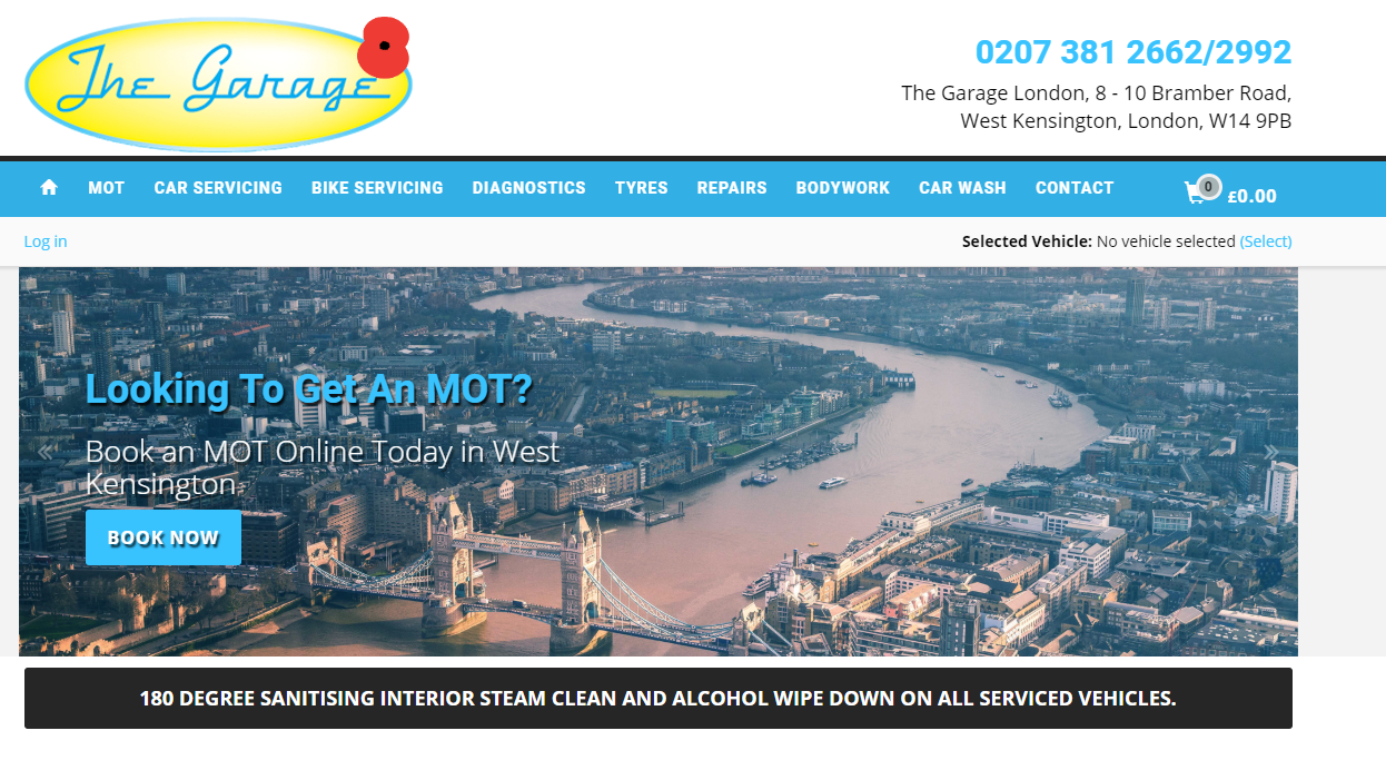
Offer on the Landing page to secure interest and get people reading further.
Straightforward categorisation of services offered. Not missing any opportunity to compile a mailing list of customers. Clearly a website needing short to the point copywriting.
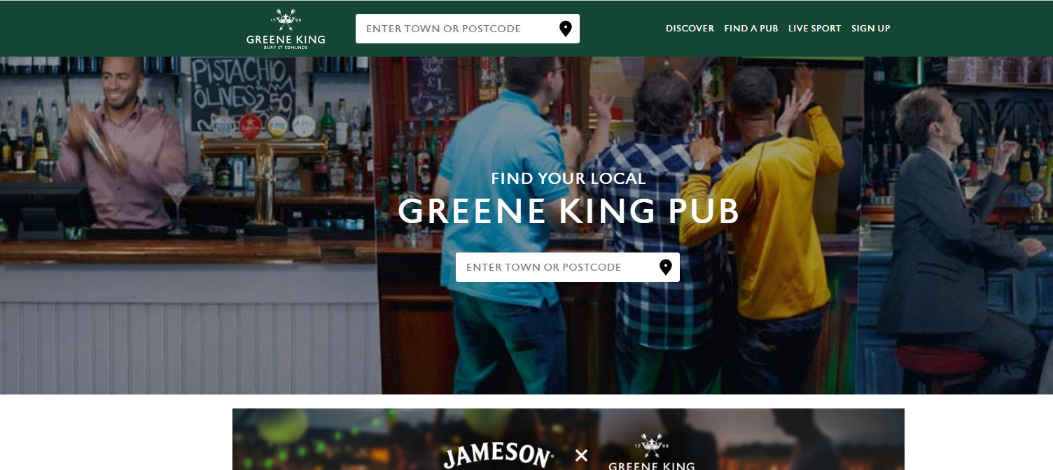
A Chain of Pubs with a Landing page showing the domographic profile of customers enjoying Sport on the TV showing the enjoyment and social side of the pub apart from the large selection of beverages.
One of the main expectations of a Good Pub.
Content Marketing is one of THE most important aspects of web design, even for a pub.
And an exploration of this web site would show you there’s plenty of stories to be told here giving an image that this pub has lots to offer in terms of events and a place of fun.
Standard Websites
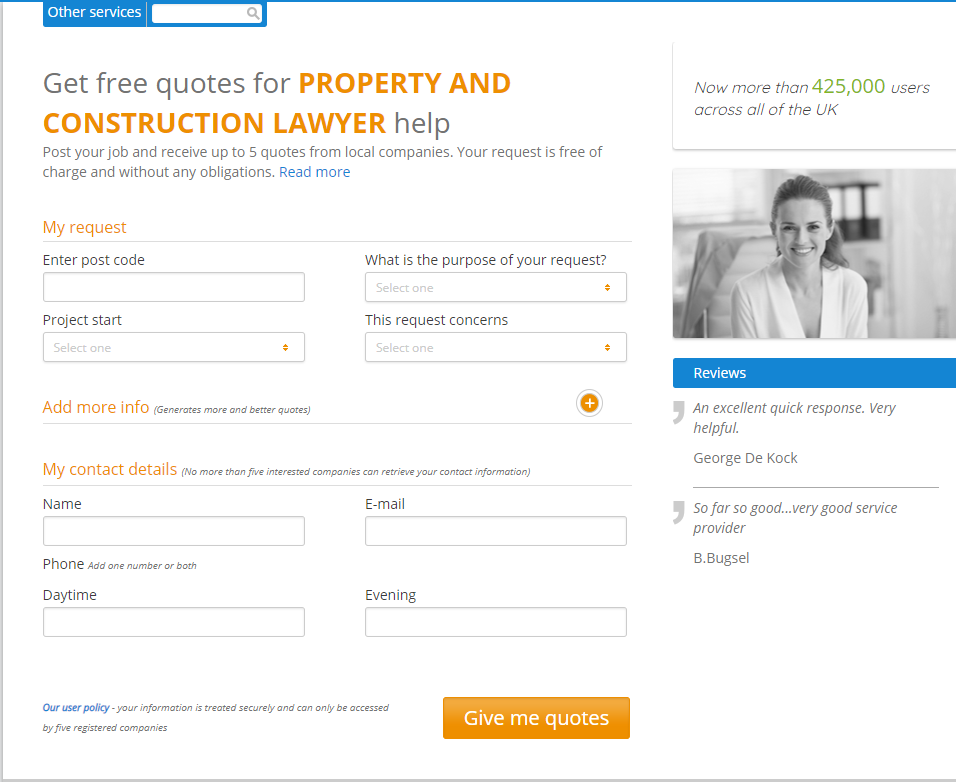
https://uk.servicestart.com/ (Services Comparison Site)
A Comparison site for Miscellaneous Services. The form may seem involved but it’s an easy thing to do. The way the site is designed meets it’s target audience’s requirements (C1C2 profile) of getting the best value for money. Similar to the one for lawyers in the Standard website section.
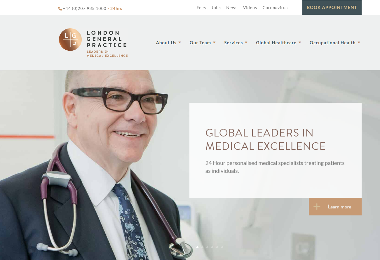
https://www.thelondongeneralpractice.com/ (Private Doctors)
Aiming at the “A” demographic community and psychographically segmented, the copywriting and imagery portray top private medical care. The messaging underlines the importance of individual care as opposed to the “conveyer” type medical care of the NHS, where queues prevail and time per patient is lower.
Although many would think this is an advanced website, it isn’t. This is a standard website as nothing complex is used but extensive in its menu and descriptions of the doctors that work here.
https://www.thelawsuperstore.co.uk/ (Legal Website)
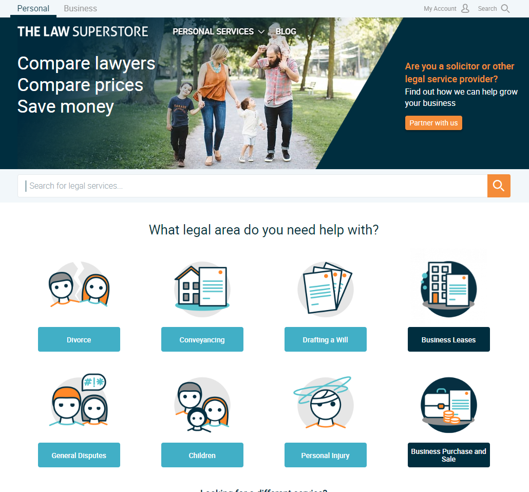
A comparison website for the legal world, but in particular family law. The landing page’s message of comparisons to save money is clear and dovetails well with the family photo on it. Don’t be fooled by the simplicity of this website. It meets its objectives very well.
Once you start to explore the areas listed you will find matter of fact long, but clear, copywriting which is perfect for this type of business. Clients want to know as much as possible about what they can expect from the lawyers involved before they engage them and that is what long copywriting is suited to. The website uses AIDA very well as prospects are drawn from the simplicity of the landing page to detailed explanations of the processes involved without losing the visitor’s interest.
https://www.rapidformations.co.uk/ (Company Formations & More)
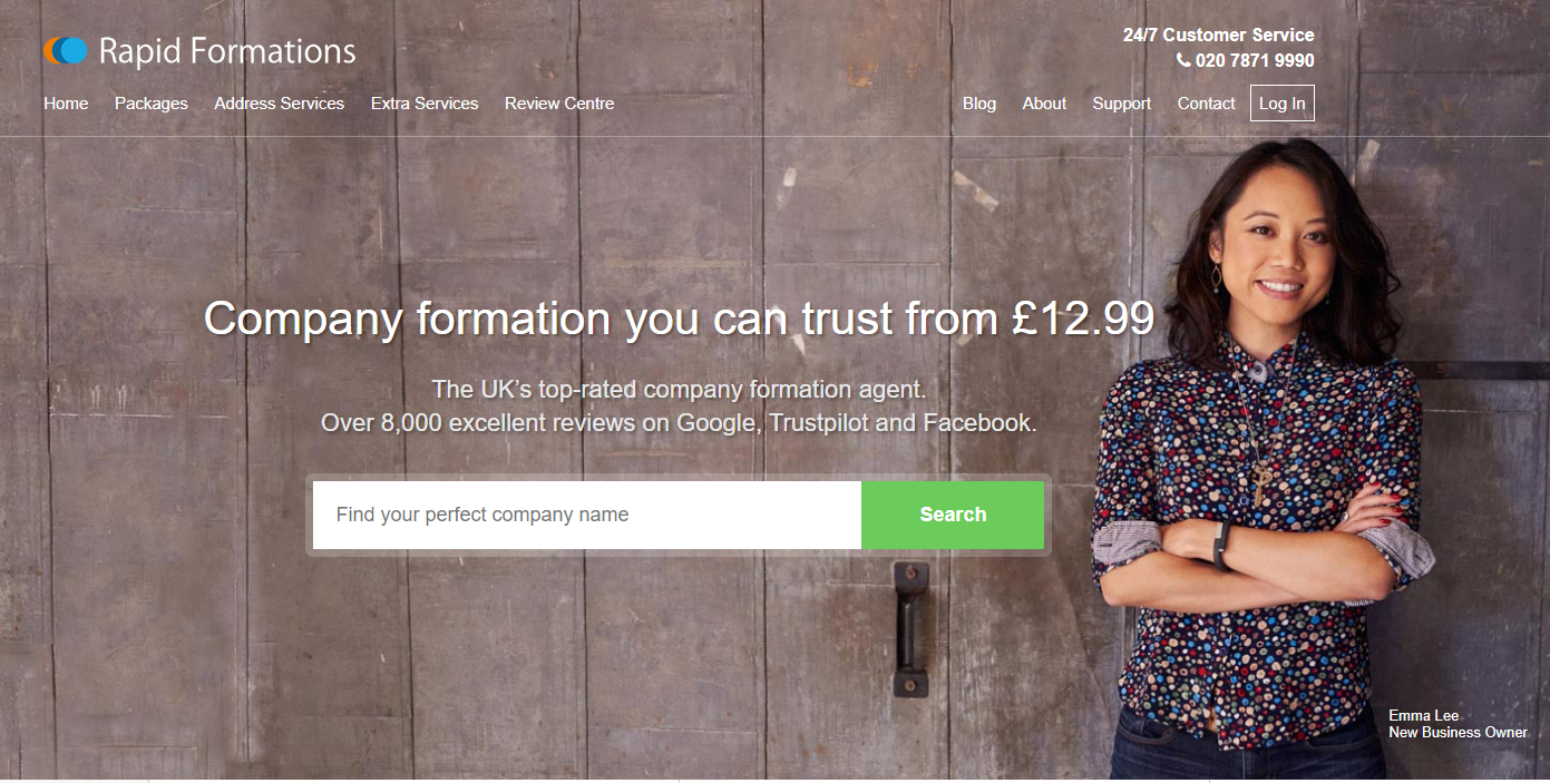
Although looking like a straightforward standard website there is more to this than meets the eye. The message is clear on the landing page and the menus are easy to navigate. Go into the Blog section and you find a host of useful articles to help startups from ideas on specialist businesses to business checklists.
Ambitious Websites
https://www.marianboswall.com/ (Landscape Architects)
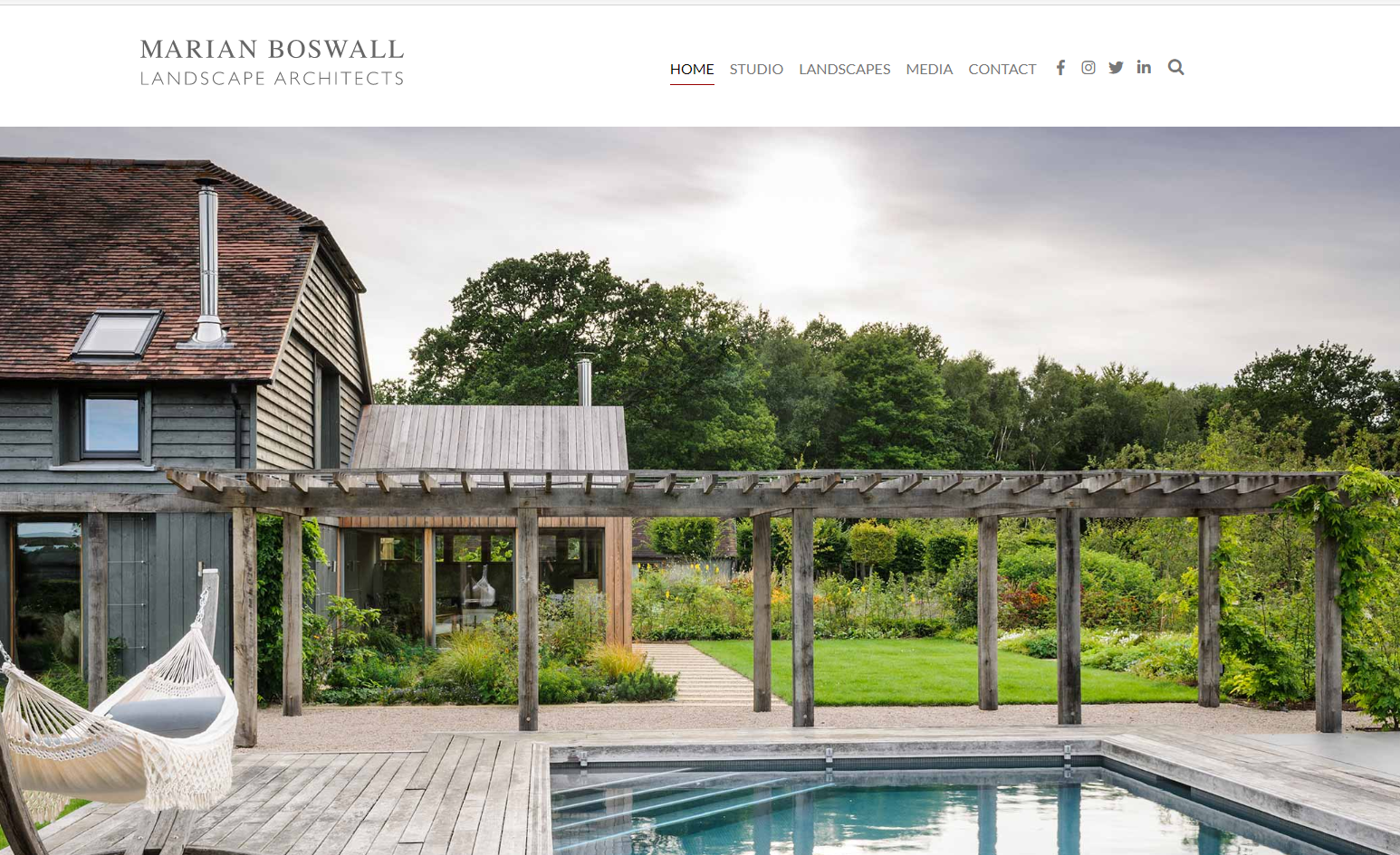
Although obvious how to design this site (By examples), and what the central message should be (outstandingly talented) , the type of images chosen, backup media evidence (In specialist magazines), referrals, awards, and tremendous copywriting reflects so strongly on the company that most visitors who are interested in a “money is no object for the best” can be assured this is exactly what they will get before even picking up the phone.
The navigation is simple and clear demonstrating the heirarchy of importance at its best.
It is so strategically strong in almost every area that any competitor had better find an agency of similar quality, or appeal to a different audience because coming up against a website like this speaks for itself.
https://www.fosterandpartners.com/ (Building Architects)
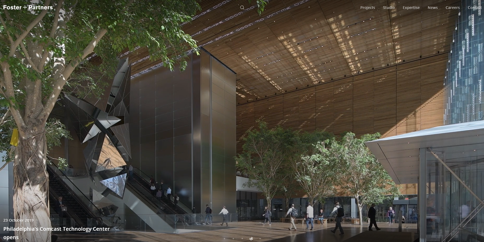
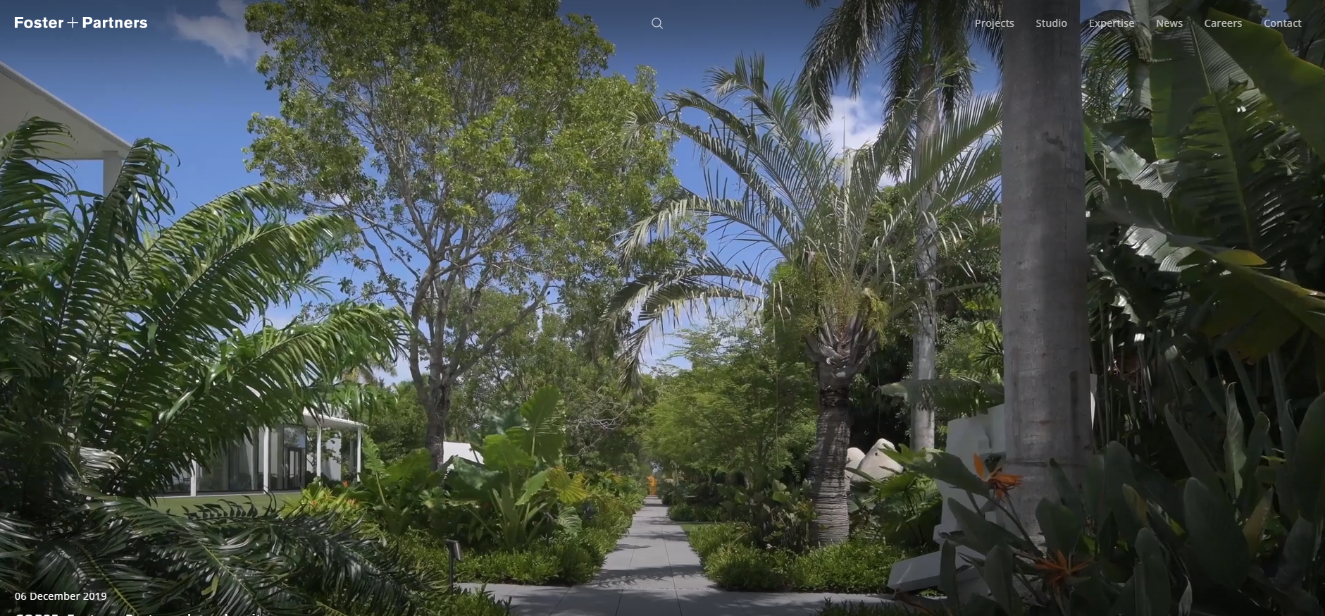
Movement on a Landing page is a statement completely appropriate for the scale at which the buildings are designed and built here. The Landscape Gardening that goes with shows the delivery of not just building architecture but the capabilities to deliver a Turn Key project.
It gives an immediate idea of the type of work this team deal with. A picture paints a thousand words which is why the copywriting is short, but consistent with what is being demonstrated.
It is imperative that with a firm of this nature that the website is projects the same image or brand that its referrals make. This web site meets all its communication and specific branding objectives perfectly.